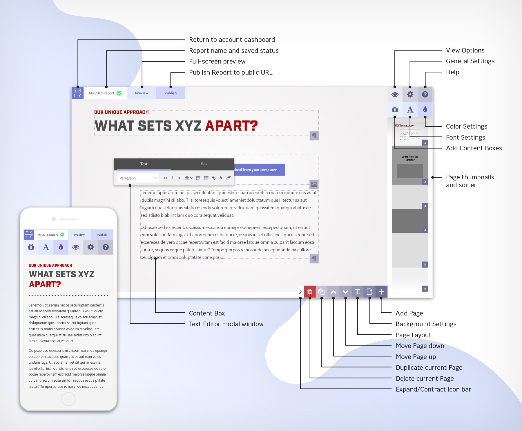
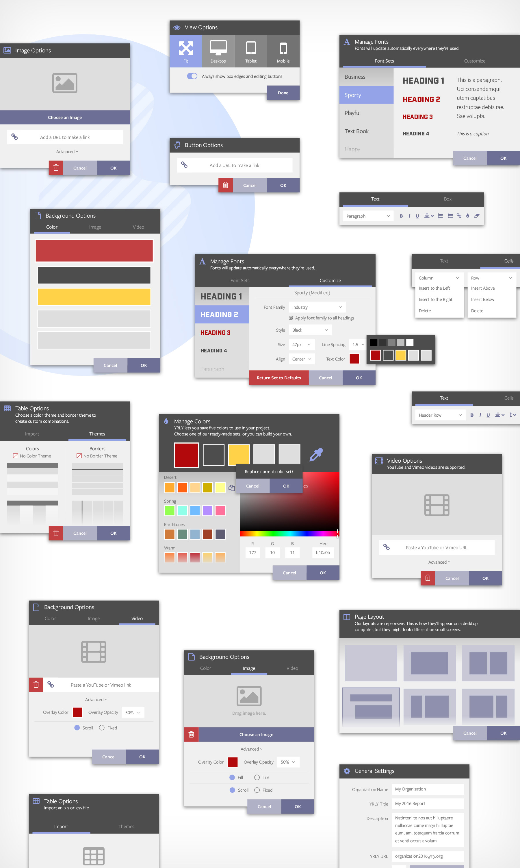
YRLY’s concept is simple: a tool for non-profits to publish a single-page website with everything they need to report for the year. I strived to make the app as intuitive as possible while allowing users of all levels of design and computer skill to create reports easily. Users can work with presets (templates for page layouts, built-in libraries for colors and font sets) or customize them to better suit their organization. Features targeted specifically to non-profit users include the ability to quickly build tables for financial reporting.
One aspect of the interface that I thought could be improved on from other WYSIWYG apps was to clearly show areas where new content containers can be placed. Below is a user flow showing the creation of a new section in a report. (1) Choosing a layout, (2) adding content boxes, and (3-4) filling boxes with content.
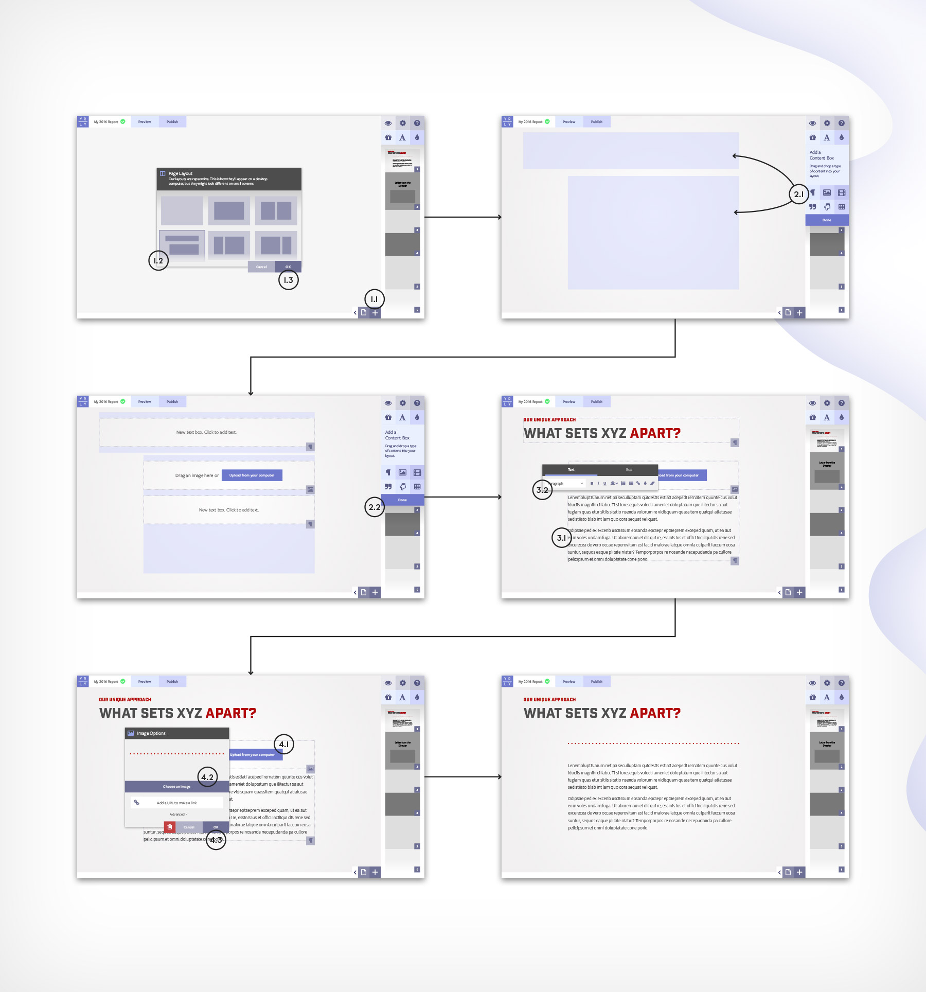
Early in the planning process it became obvious that modal windows were the best option for building all of YRLY’s tools within a consistent user interface.
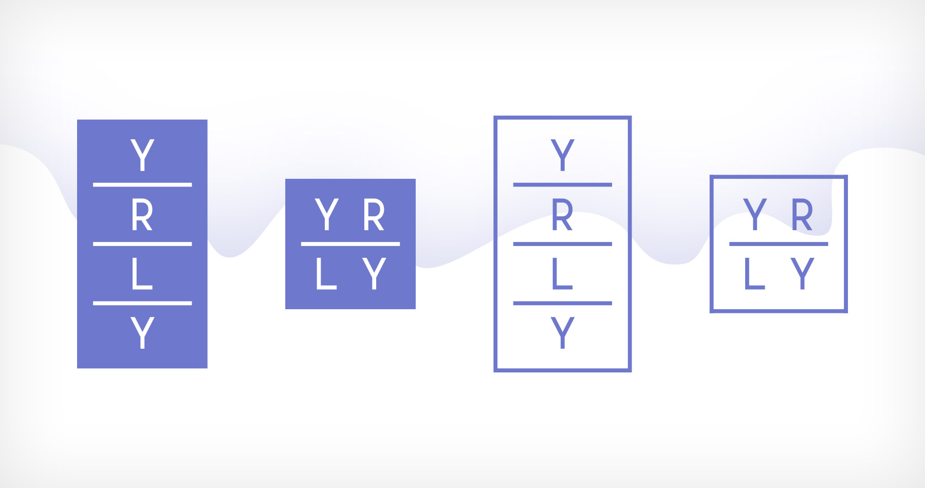
The YRLY logo represents a YRLY report: the letters are stacked in the container rectangle like the pages in a report. The logo is responsive so that it can be used in smaller spaces where the primary vertical logo may not function as well, for example, in the app header.
The initial homepage highlights the benefits and features of YRLY. The site will grow with the launch of the app to include a Theme Gallery, Pricing, a thorough Help section, and other pages.
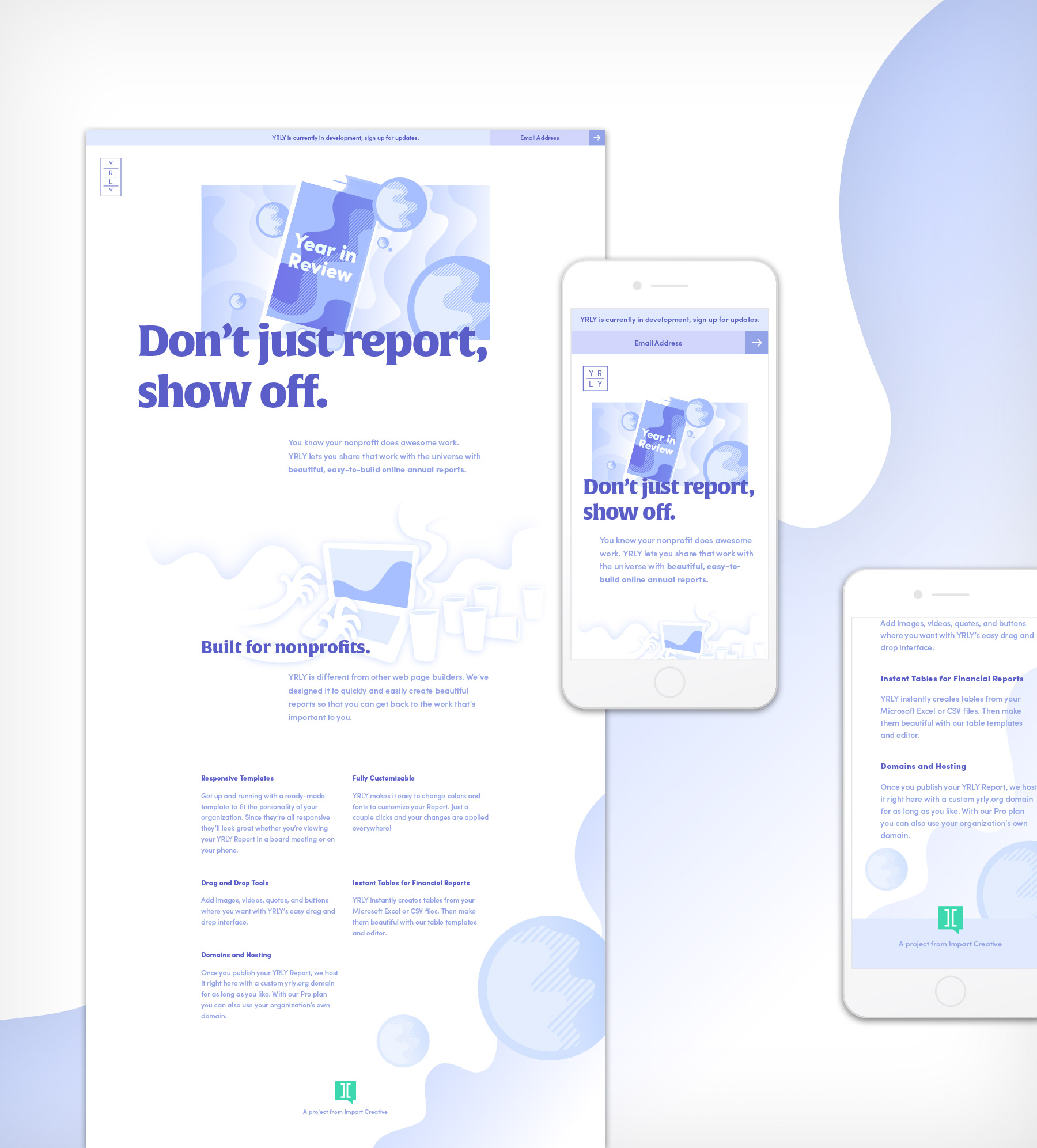
The hero image is an SVG that I created in Illustrator and animated using Greensock. The combination of technologies enables me to create complex animations quickly and ensure cross-browser compatibility, while maintaining small file sizes and high frame rates.